Magazine Analysis – Charlotte Lloyd
NME
Magazine

The cover:
1) The title: why is it called that? What
does the title connote?
The masthead of this magazine is
‘NME.’ This stands for new music express. This is a suitable and appropriate
title as the magazine is most famous for promoting upcoming and new to the
market artists. The magazine is aimed at a target audience from the age of
15-30 years old and therefore masthead is cleverly aimed at them, who are most
relevant to this genre of music.
2) The masthead/title logo – analyse it.
The masthead is in bold block red
and white colours making it stand out from the background. It also using the concept of only having 3
letters makes the title more rememerable. It also helps save space to put in
other information as using ful words would talk up to much of the page and
would no longer be a short, snappy tite. Also the 3 letters form a shape within
the block making it easier to recognise.

3) Is there a strapline? Analyse it.
The strapline for this issue is
‘Young Britannia 2013’. Each word being in a separate box and being the
biggest, boldest words on the cover (despite the masthead) this clearly
indicates it the main feature. This strapline is very patriotic which creates a
great bond with British readers and encourages the reader to discover more. I
feel by using the word ‘young’ attracts to their target audience and allows
them to relate to the story. NME have
clearly summed up the whole feature in just 3 words, making it short and snappy
and keeps the readers interested. It fits NME’s house style of not being
conventional.

4) What is the main image? Analyse the facial
expression, direction of gaze, body language, clothing etc. How does this reach
out toward the ideal reader identified above?
The cover of this issue is
actually an out fold of 3 pages. Therefore the main image is carried across all
3 pages. Consequently there are 18 people photographed as the main image. It is
a very unique image and has all 18 people playing around with fire extinguishers
and jumping on each other’s backs. The images on the first page of the cover
are bigger and clearer, showing that this is the main cover of the front page.
It also has one artist miraculously bigger than the rest, consequently showing
that he is going to be one of the main focuses of the article. There is a clear link between the strapline
and the main image. You can clearly tell that all these young people are the
main feature/article inside. The background colur is a deep blue, making
everything else on the page stand out a lot more, making it easily noticed and
easy to understand and read, as there are no colour cashes. Also there are only
3 colours used on the front cover – red, white and blue. This creates a strong
relation with the strapline of ‘Britannia’, as these 3 colours make up the
British flag. Therefore there is a correlation throughout.

5) What others images appear on the front
cover – why?
There are no other images used on
the front cover and this is because simplicity is better. Using other images
would become to confusing and would clash with the layout. Keeping it simple
and easy to read would be more sensible then trying to cramp lots of images all
onto one pae.
6) What content is promoted by the
cover lines?
There is only one cover
line on the front cover. ‘Say hello to the future of British music – “hello”.’ This promotes people to look into change and open up to the new British music industry. They want people to agree to change and give these new upcoming people a chance before judging them. They may be different but sometimes change is for the better. They are trying to promote people to read their article/feature and see what opportunities these artists bring.


7) Explain the connotations of typefaces
(fonts), graphics, colours etc.
The first connotation you notice
is that the colour schemes used match the British flag of red, white and blue.
These are the only 3 colours used on the front cover showing a strong relation
to the main feature of ‘Young Britannia 2013’. Also the typeface used is very
childish and sans serif, which connotes that the issue is aimed at younger
people oppose to the older generations. Lastly the graphics used such as
childish arrows and rounded lines to each articles connote that the magazine is
very informal and it is not a serious important article.


8) What sort of language/ language features/
language devices/ can you identify? How does the cover ‘talk’ to the reader?
Say hello to the future of
British music – “hello” – clearly indicates that it is very informal. They have
used a rhetorical question to show the audience they don’t have a choice in the
matter, however to stop it from being to serious and controlling they cleverly
answer there own rhetorical question using sarcasm to show humour and wit
within the article.
9) Does the cover look similar to
other magazines? If so why? What does this magazine offer which rivals don’t
(ie what is its USP)?
The cover does not look similar to other covers as it's layout is completely different. Unlike other magazines NME keep their front covers very simple, not giving away any important details but enough to hook in the audience to reading more. They keep colours very minimal to avoid any colour clashes and confusion. The typeface and writing is always very plain, clear and sans serif making it easy for the reader to understand. They offer a small quote down the side of every issue again making it very unique. Their main USP is that they offer ' THE PAST, PRESENT & FUTURE OF MUSIC' as no other magazine offer such a wide range of music.


The cover does not look similar to other covers as it's layout is completely different. Unlike other magazines NME keep their front covers very simple, not giving away any important details but enough to hook in the audience to reading more. They keep colours very minimal to avoid any colour clashes and confusion. The typeface and writing is always very plain, clear and sans serif making it easy for the reader to understand. They offer a small quote down the side of every issue again making it very unique. Their main USP is that they offer ' THE PAST, PRESENT & FUTURE OF MUSIC' as no other magazine offer such a wide range of music.
10) Is there anything else
distinctive about the cover/format? (eg size)
There is one big distinctive difference about NME's cover/format - the front cover is a 3 page out fold. Instead of just being one, it folds out three times to show more about the article and feature. This is a very distinctive format choice as no other magazines offer this, immediately giving NME an advantage above the other competitors.

Inside:
1) How many pages are there?
There are 66 pages inside this
issue of NME.
2) How many pages of adverts?
There are 11 pages of advertorials
inside this issue.
3) Categorise the products advertised into
types.
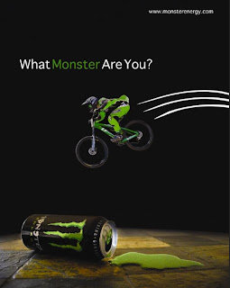
-Upcoming music/Concerts
-Drink
-Gadgets

4) Make a list of the features/articles
topics in the magazine.
-The music industry
-Life related issues as a young
person
-Celebrities and there lifestyles
-What’s popular right now
5) Categorises the features/articles into
types.
-Interviews (e.g. There are
interviews with famous and new musicians and the experiences they are/have
faced.)
-Reviews (e.g. there are reviws
on recent gigs, concerts, songs and albums.)
-Research artices (e.g. there are
research articles into issues affecting a yng perons life, for example drugs.)
-Reports (e.g. they report on
previous concerts, arenas and areas conerts have been held and what there is to
watch out for next time.)


6) How many double page spreads are there?
What are they about?
There are 11 double page spreads.
The first one is about the 20 essential nw tracks you should be listening to.
The second is about drugs found at festivals and what the affects are. The
third is about a reviws on a newly released album ‘How to stop your brain in an
accident – Future Of The Left.’ The forth is about the gig of the week – ‘Fat
White Family.’ The fifth is another review but this time about ‘Jay Z live’ –
what was good and what was bad. The sixth and seventh are about upcoming
concerts that they recommend you buy tickets for. The eighth is the main
feature of the issue – ‘Young Britannia 2013’ about the new young artists of
the future of Britain’s music. The ninth and tenth is this article carried on.
The eleventh is a scene report on what the police are cracking down on and what
to watch out for.
7) Are there any ‘advertorials’ where it is
not clear if something is an article or an advert, or a mixture of both?
There are no advertorials that
look similar to any articles or features in the magazine as the brand identity
and house style of NME has been cleverly thought out that nothing will look
similar to it. They do this by using their own unique layout and colour schemes
and graphical elements so no confusion is caused.
8) How does the magazine achieve a unified
‘house style’? Think about language and mode of address, colour schemes,
graphical elements, etc.
The magazine does achieve a
unified house style as they keep the same colours and layout concept
throughout. They have the same mode of address and graphical elements such as
lines under every title, putting all main text on a block of bold colour and
using miniature arrows as indents.


9) Why is this house style appropriate to the
target audience? What assumptions does it imply about the TA?
The house style is very modern
and up to date implying that their target audience would be of the younger age.
They would be attracting to the 15-30-age bracket. They have kept the magazine
style trending to its era and therefore keep in fashion. They aim to create
their house style young by using bright colours and lots of images, all mainly
staring young people.