Showing posts with label Front Page Planning. Show all posts

Tuesday, 18 March 2014

Original Images

Original Images

Contents Page:


Front Page:
Double Page Spread:
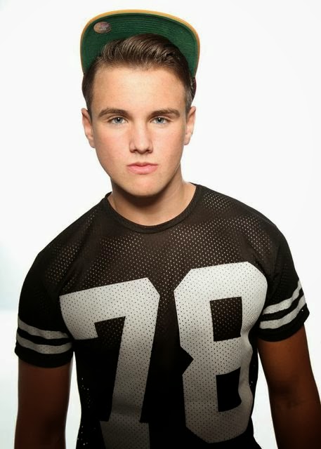
This image was used for my first double page spread.


This was the image used for my second double page spread.

Monday, 27 January 2014

Front Page Planning

Front Page Planning

I firstly researched all the common conventions of a front page. For example typography, type of shot, etc. After my extensive amount of research, with all the knowledge I had gained I combined it all to make my front page plan. I planned where I wanted my title to be, where and wanted I wanted my cover lines to be and where I wanted my vital information, about price, barcode and QR code to be.

Sunday, 12 January 2014

Font/Masthead/Typography


Analysis:

The masthead is one of the most important things to a magazine front cover. It is the first thing that the consumer will see, therefore needs to be bold and eye-catching. As you can tell all of the above mastheads use strong bold colours meaning that they are instantly recgoniable. As well as using strong, bold colours, they also use block colours, making them stand out more, empathising the effect. They also all use very sharp, bold fonts. All of the fonts are used to enhance the mastheads, ensuring its the first thing the costumers see. All of the titles are short and therefore straight to the point. This could insinuate that their magazines follow the same principals, meaning that they can be easily processed. 

Also mastheads such as 'Kerrang', use design elements in their title. Keerang has an affect that makes the text look shattered, or breaking apart. This connotes to imply that the magazine is going to be quite edgy and sharp, which is exactly what it is. It also has an explanation mark at the end, again connoting it is a bold, sharp magazine. That it contains music that makes a statement and is very different and rocky. Therefor after taking into consideration my research, I will be ensuring that my masthead has very bold, block colours. 

I will also ensure that the font is either blocked and bold, enabling it to be very eye-catching or include a design element to give it a unique look, that would make it stand out on the self compared to any other magazine.

Understanding type of shot


I have researched the three main types of shots used for a front page cover image: close-up, medium shot and long shot. I have given both advantages and disadvantages to all three and also concluded to what shot i will use and why I have used that shot. I have included examples of all three types of shots used in magazines in my chosen genre and looked at what types of mages work the best and why.

Thursday, 2 January 2014

Final Magazine Name

After all consideration I finally needed to decide on what I wanted to name my magazine. I started with 8 potential names of Vibe, Free, Volume, Replay, Voice, Play, Octave and Sync. I then asked 37 people what they preferred as the best name and what they think would best suit my magazine knowing my genre of dance music. 


From my results I can see that the top 5 names were Vibe, Volume, Play, Voice, Sync. I then decided to develop these 5 options either further and used the thesaurus to see syonmmons to see if I could find any alternatives. I decided not to look into alternatives for volume as they were not appropriate or worth considering.


From my further research none of the supplied alternatives were really appropriate, (see in previous post) or what I thought to better than my selection already. Therefore instead of changing the words I decided to play with graphical elements. I started with changing the 'a' in Play to a play symbol, changing the 'e' in volume to a speaker and making the whole of 'sync' uppercase.


After I then asked people what they preferred out of my three final options. The feedback I received was very controversial. Some people preferred play, due to its graphical elements, where as others preferred the others for their uniqueness and individuality.


From the feedback I received the most positive came from Play, however after i trialled the names against possible front page photos in photoshop, I realised that Sync was in fact the most visually pleasing, therefore I have concluded to SYNC as my final magazine name.

Wednesday, 1 January 2014

Potential title name devloping

After looking over all of the feedback from my potential title names, I discovered that the favourite four were: Vibe, Play, Voice, and Sync. Before I settled with either one of these three, I wanted to ensure I had researched into each one to make sure I was completely happy with my choice. I thought the best way to investigate more, was to look for synonyms of each word to see if there were any alternatives I really liked.

Vibe:


From the selection I was given for Vibe, there were only a few that I actually liked. Firstly I was drawn to rage. I liked rage a lot, I felt it was strong and eye-catching and very easy to remember, however after thinking very carefully I concluded that it does not fit with my magazine or the genre I am focusing my magazine at, so I decided to discard this name. I also thought that drive was a very strong name, but again after thinking it through it does not really connect to music, making it hard to find a link between my magazine and the name. Also the last two I really liked were sensation and tremor. However again after consideration neither were suitable for my magazine. Therefore after being unsuccessful with vibe, I moved onto my next word.

Voice:


Next I looked into synonyms for voice. There were only two words that I thought stood out for me. The first one being tone. I really like tone and i concluded it links really well with my magazine, linking with sound and singing (tone in voice.) The second that sticks out is shout. I really like shout for a potential name as it links well, with my magazine and the music industry, however I feel that it might not specifically link with my chosen genre.

Play:


From the selection of words I was provided for play, I realised that most were related with having fun, not musically like I had hoped. My use of the word play, is related to play, pause and stop of controlling music, therefore none of the words above were ideally appropriate for my magazine. Despite this I still liked the idea and concept that my title could be double interpreted, and thought to be fun and enjoyable as well.

Sync:


Lastly from the selection of the words provided for sync, none were particularly eye-catching. None of the words are ideally the theme I was going for. I believe that if I had to pick one of the words, I would pick synchronize. This is the most related and and can have several meaning for my magazine, however despite this the title has 11 characters, which I believe if way too long for a magazine title.