I have decided to create a Wix website to present my evaluation questions. I feel like this is the best and easiest way to present my questions as they are better organised and easier to navigate around. It also shows my extended knowledge and use of technology. To view my evaluation questions follow this link: http://charlotte110897.wix.com/evaluation-questions
First I created a plan of how I wanted my double page spreads to look. I did this so I could tell where I wanted to place photos, where I wanted to put my content, and where I wanted to place my page design elements.
After creating my flat plan, I could then start my construction. I started with the basic layout, keeping in mind, where my text was going to be placed and where I wanted my design elements to go.
After I had finished my construction, I noticed that one of my page numbers did not match up therefore I changed it and checked that everything was perfect.
I then added in the text and added a pull quote. I also added my design elements: page numbers, magazine identity, page design, borders, and backgrounds.
This is what i thought was my first final front page. I then realised that after reviewing the page, and receiving an extensive amount of feedback, I realised that my shade of red, was to dull and not catching the readers eye. Therefore I increased the brightness of my red.
This was my first draft of what I thought was going to be my final contents page.
However after more research was conducted I decided I needed to include more images on my contents page. Therefore I decided to rearrange my page and add more images to make the contents page look more life-like and professional.
However after adding in images I decided I wanted to use one of the images for my double pages spread, therefore I had to replace the image with another image I have.
After my final review, I decided that the best decision was to change the colour of the page numbers over a few of the images. I did this so that they were clearer and easier to read. I also realised I had put the wrong page number on one of my inserted images, in the left hand column.
I started my planning by researching common conventions of a double page spread article within the music magazine industry. After I had completed all my research I decided to draw up a plan of what I wanted my dps to look like. I included where I wanted my title to be placed, where I wanted the picture to be placed and where I wanted my title and design elements to be.
I have researched what are the key components of a successful front cover of a music magazine. I looked into cover stories, colour schemes, design elements, layout and images.
Conclusion to my research
I have realised from my research that
there are a few vital things I need to include on my front page. Firstly I have
realised that I need to include a bold eye-catching title so people know
exactly what my magazine is. I also need to ensure that my main story has a
bigger cover line than the rest of my stories ensuring that consumers know what
is the most important story of the issue. I also need to include a barcode and
price to ensure people know how much they will be charged for my magazine. I
also need to ensure I stick to a clear colour scheme, so that my magazine will
stand out in comparison to other peoples on the self. I also need a clear house
style so that people can clearly tell my magazine has fluency.
I firstly researched all the common conventions of a front page. For example typography, type of shot, etc. After my extensive amount of research, with all the knowledge I had gained I combined it all to make my front page plan. I planned where I wanted my title to be, where and wanted I wanted my cover lines to be and where I wanted my vital information, about price, barcode and QR code to be.
I conducted an extensive amount of research into the common conventions of a contents page. After I conducted all my research I presented a plan of how I wanted my contents page to look. Where I wanted things situated, what features I was going to include, as well as keeping in mind, I was basing my layout around 3 columns.
First I created a plan of how I wanted my contents page to look. I did this so I could tell where I wanted to place photos, where I wanted to put my content, and where I wanted to place my title and dates.
After creating my flat plan, I could then start my construction. I started with the basic layout, keeping in mind I needed to ensure I always kept the layout to three columns. I used the line toll, text tool, and inserted images, to ensure that my contents page looked as professional as possible.
As you can tell along the construction process I decided to change and alter my design and layout of the contents page. This is how and what decisions I made and why I made them.
After I had finished my construction, I received some crucial feedback. From the response I received, I decided to change a few elements. Firstly I changed my insert image in the left column. I did this so that my audience could see more content from inside my magazine, oppose to pictures of the same artist. I also decided to change the size and where my page numbers were situated. I changed the 06 to being black and right top hand corner of the image. I also changed the 32 to being smaller and situated in the right bottom had corner. I wanted to keep all my page numbers the same size and colour to allow continuity of my house style, however this was the best decision, increasing reader comfortability and visibility. The page numbers are now a lot more clearer to read, yet still jump out to catch the readers attention.
Firstly I started my construction by planning out what i roughly wanted my front page to look like, and the layout I wanted. This gave me a basic concept to focus on and therefore work from.
Next I had to pick my photo I wanted for the main image (background). I ensured that my image was the best choice for my front cover by considering if it was appropriate for my target audience, wether it engaged readers and if it was the image was easy enough to work with. After I consider all the factors, I picked the image I wanted to use. After that I had to edit the image. I used tools such as adjusting the vibrance, brightness and contrast. I then used the liquify tool and the airbrushing tools, to make my image look more professional and fit in with current market.
Despite having made my front cover, after I then created my contents page, and two double page spreads. From making the further three documents, I realised I wanted to adjust a few more things making my house style a lot more effective.
Features Front page: - M.I.A REVEALS ALL EXCLUSIVE 'MUSIC CHANGED MY LIFE..' - 10TH ANNIVERSARY TOMORROW LAND - 30 BIGGEST DANCE TRACKS NOW - PLUS+ NETSKY|NERO| AVICII|KNIFE PARTY| STEVE ANGELLO| MAJOR LAZER| AND MORE - CHASE AND STATUS TOUR AGAIN Contents page:
1) Night people.. the pictures you regret from the night before.
2) Ultra festival - line up released
3) AVICII talks 'hey brother?'
4)M.I.A - 'MUSIC SAVED MY LIFE..'
5) Best places to spend your night out
6) How to stay safe at night
7) Real truth behind 'beef in the booth'
8) Afrojack talks about no.1 single 'spark'
9) Best parties to smash this summer
10) IBIZA - the place to be
11) Knife Party release their next venture
12) Steve Aoki talks Tommorrow Land
13) Chase and Status TOUR ONCE AGAIN
14) 30 biggest dance tracks right now
Reviews&Events:
15) SubFocus - tour or not to tour?
16) Find out the gossip behind the Le Youth rumours..
17) Ensure your ticket at Nero's silent tour
18) Wilkinsons new album??
19) Tick em off' - 10 biggest clubs you need to make sure you visit
20) It's not you, it's me - pick your rave partner carefully..
Page furniture is made up of small decorative elements, which create a more interesting and visually pleasing professional setup. They also help unify house style and make your magazine stand out above the others. They can vary from drop caps, to watermarks behind text. The overall aim is to achieve a more interesting and eye-catching spread. There are all types of design elements such as: drops caps, watermarks, embellishments, borders, typography and shapes and clipart. Design elements give magazine an edge above others, making them unique and recognisable.
After all my research I have realised that I would like to include a few design elements of my own, to ensure that my magazine is professional and has high levels of realism. I have made a short clip of a few page furniture designs I am going to ensure I include in my magazine.
Analysis: The masthead is one of the most important things to a magazine front cover. It is the first thing that the consumer will see, therefore needs to be bold and eye-catching. As you can tell all of the above mastheads use strong bold colours meaning that they are instantly recgoniable. As well as using strong, bold colours, they also use block colours, making them stand out more, empathising the effect. They also all use very sharp, bold fonts. All of the fonts are used to enhance the mastheads, ensuring its the first thing the costumers see. All of the titles are short and therefore straight to the point. This could insinuate that their magazines follow the same principals, meaning that they can be easily processed. Also mastheads such as 'Kerrang', use design elements in their title. Keerang has an affect that makes the text look shattered, or breaking apart. This connotes to imply that the magazine is going to be quite edgy and sharp, which is exactly what it is. It also has an explanation mark at the end, again connoting it is a bold, sharp magazine. That it contains music that makes a statement and is very different and rocky. Therefor after taking into consideration my research, I will be ensuring that my masthead has very bold, block colours. I will also ensure that the font is either blocked and bold, enabling it to be very eye-catching or include a design element to give it a unique look, that would make it stand out on the self compared to any other magazine.
Audience expectations are the advanced ideas the audience expect to see in the magazine. This particularly applies tot the genre pieces. You can play on and shatter the audience expectations, to gain more or less consumers. For the type of magazine I am creating, I have decided to agree with my audience expectations and use information such as my audience favourite music, and experiences to ensure that I meet my audiences needs/expectations.
From my research results of my audience expectations, I have included some examples of the types of music they listen too, types of things they do, and therefore the types of ideas I will include in my music magazine (below.)
The type of music my audience would expect to appear in the magazine are songs and artists suggested in the playlist below:
My target audience would expect to see articles based on upcoming artists and the new comping trends of electronic music:
I have picked dance as a genre, however not forgetting many sub genres within. I will be focusing on drum and bass, trance, dub-step, and disco genres as well as dance itself. Brief History Dance music originates from the 1970s by using computer generated sounds and synthesized sounds. The roots of dance music are Jamaican dub, Funk, Disco and European synth-pop. They are all styles of new instrumental versions of songs made by remixing. They mix different elements of the songs to be pushed backwards and forwards within the song. They add effects like echos and reverbs and increase the speed to make the songs more dance like. The most famous synthesized song was Donna Summers 'I feel love.' There are several techneqiues used to create the electronic tones and they add severeal effects to make the song sound computerised. Techneqiues used in such songs have been continued to carry on in electro and house music, evolving from the originals of dance. As time passes dance music has evolved with drum and bass/rave and trance music becoming highly popular in the last decade.
Donna Summer - I feel love
Martin Garrix - Animals Artists There are several artists that have released singles in the dance genre, far to many to write. I will list the 10 most common, and recent artists to date. The dance genre it a very competitive genre, with several artists doing a lot better than others, however it is also a very popular genre with the general public. 1) AVICII 2) CHASE AND STATUS 3) SUB FOCUS 4) WILKINSON 5) AFROJACK 6) RUDIMENTAL 7) CALVIN HARRIS 8) DISCLOSURE 9) DJ FRESH 10) BREACH
Iconography
Iconic images associated with dance music range in many different ways. At the start of the evolution of dance, it was all about sparkly clothing, flared jeans and platformed shoes. The iconography has not necessarily changed that much, only evolved into common day trends. Now it is associated with dj, electronics, raves, lights, festivals, and alcohol.
I have researched the three main types of shots used for a front page cover image: close-up, medium shot and long shot. I have given both advantages and disadvantages to all three and also concluded to what shot i will use and why I have used that shot. I have included examples of all three types of shots used in magazines in my chosen genre and looked at what types of mages work the best and why.
House Style is one of the most important elements to a
successful magazine you need to ensure that your magazine is recognisable
within itself. If the magazine was pulled apart you should still be able to
tell what pages belong to which magazine. Magazines achieve this by using
unique page design elements that distinguish their magazines from others. Many
have specific fonts to their magazines that make it instantly recognisable
where as other have logos and design elements such as arrows pointing to the
next page. Despite all the different variations of house style elements
whatever they use should make their magazine unique to others, but similar to
their own. The front page, contents page, and articles within, should all have
either very similar colours, layouts or features. It is established by keeping the colour scheme and typography the same and fluent throughout the magazine. It enables the read to feel continuous and comfortable. If there is no house style then the magazine feels jumbled and out of place. By keeping a visually pleasing house style, means the magazine becomes more recognisable and easier to establish from other magazines.
Kerrang has a traditional colour scheme of black red and yellow. This is shown repeatedly throughout the magazine showing a strong continuous house style. Even for text, titles, layouts and backgrounds the colour scheme is kept the same to indicate the fluency.
As well as colour schemes, they also keep the same typography. They keep the same design elements throughout the magazine, E.g. like the background and font used for the sub titles of each page/section of the magazine. By doing this you can easily tell that all the stories are from the same magazine.
They keep the same font throughout the magazine, this clearly indicates that they are again all from the same house style. The articles all flow from each other, keeping fluency throughout the magazine once again. The font size is kept the same for the double page spread articles to identify the difference between the articles.
Therefore from my research I have discovered that keeping a fluent house style is very important and one of the key objectives to ensuring I have a successful magazine. It will ensure that my magazine is kept professional and can achieve the maximum levels of realism.

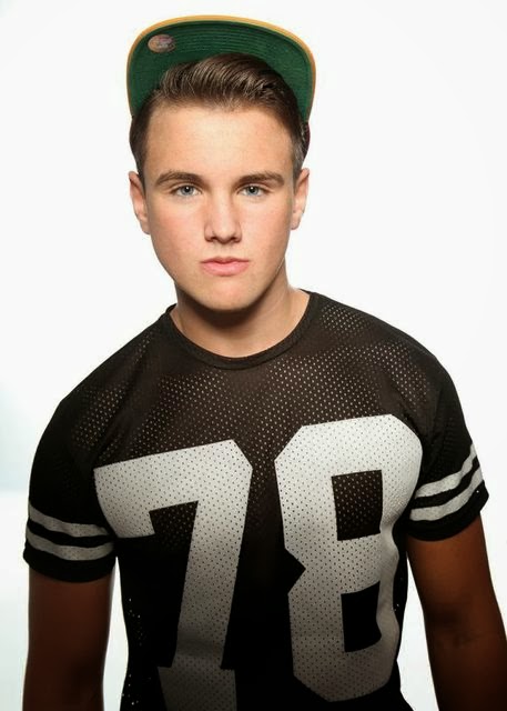

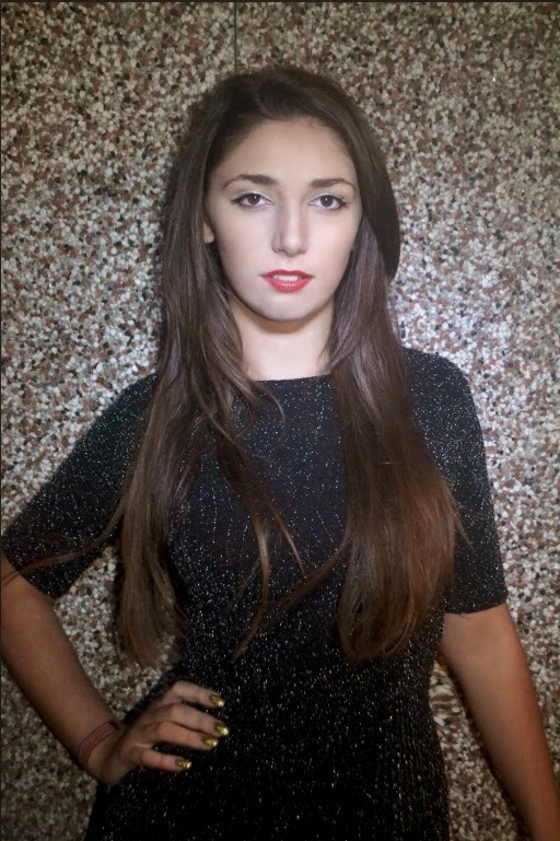

 This image was used for my first double page spread.


 Kerrang has a traditional colour scheme of black red and yellow. This is shown repeatedly throughout the magazine showing a strong continuous house style. Even for text, titles, layouts and backgrounds the colour scheme is kept the same to indicate the fluency.
 As well as colour schemes, they also keep the same typography. They keep the same design elements throughout the magazine, E.g. like the background and font used for the sub titles of each page/section of the magazine. By doing this you can easily tell that all the stories are from the same magazine.


